Pattern Match
Pattern can be seen as terrifying but used with confidence it can lift a scheme from safe to stunning. Personally I love a bit of pattern, enough to create interest yet not so much as to overwhelm.
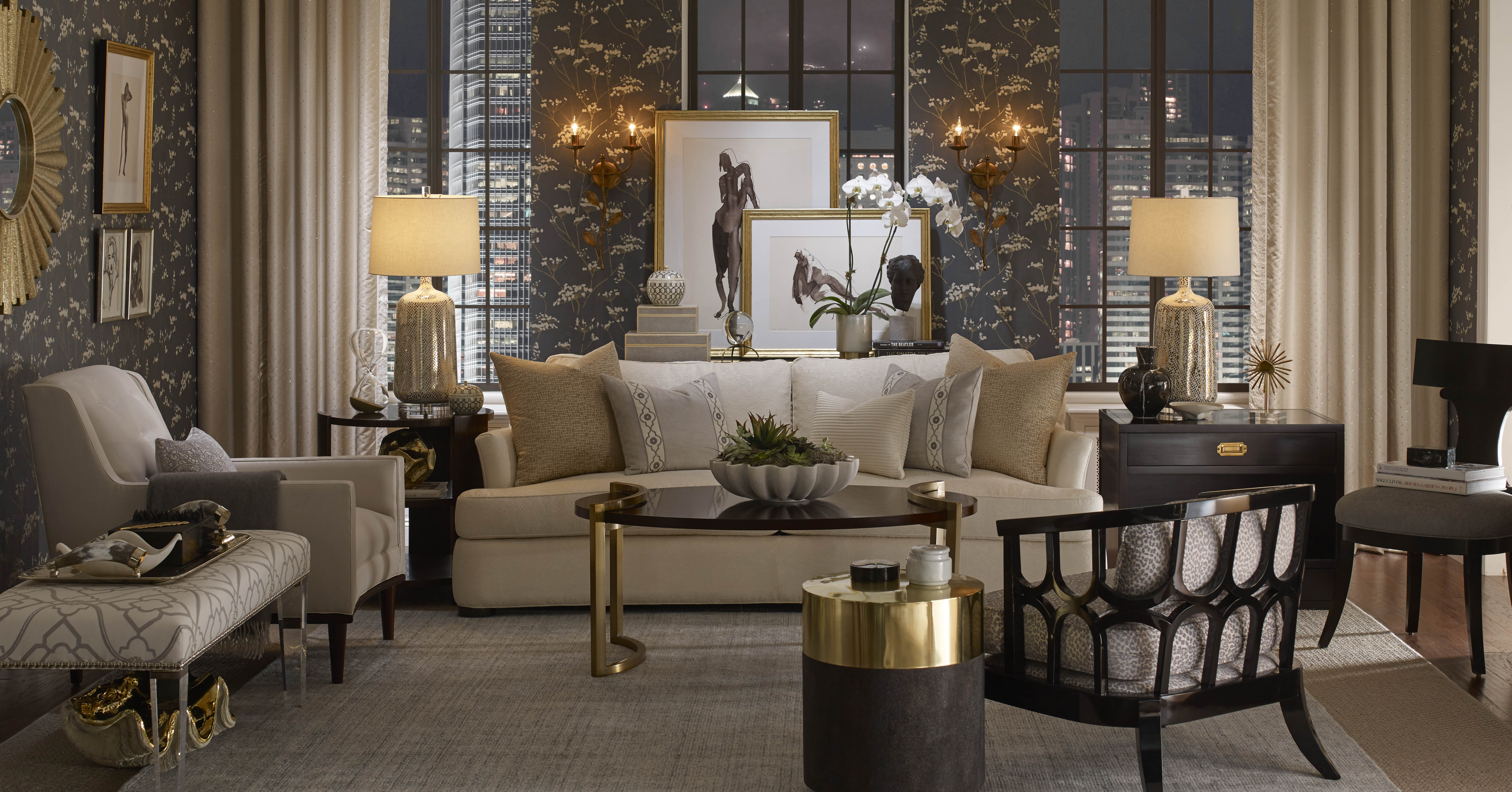
I start with what I call my lynchpin design, now this is usually fabric but it could be a wall covering or perhaps a piece of art which my client wishes to weave into the scheme. The principal colour in the pattern should then play the main role in the design. The effect of this is that the eye is then drawn to the colour rather than overpowered by the pattern. For ultimate impact all the hues in the pattern should be reflected somewhere in the room. This does not need to be in another fabric; it could be the metallic finish of the light fitting perhaps or the stone of the fire place.
All colours sit in seasons. Spring hues are pure and clear, the bright primary palette so often used around younger children. The summer palette is greyed and muted, sun-bleached almost. If you were to add black to the pure colours of spring you would get your earthy autumn shades and then finally the winter hues range from deep and intense to icy. Multi-coloured patterns to me work best when these colours sit in the same tonal colour palette. That is not to say that there are not many multi-coloured patterns around which combine seasons; there are and I guess that these are perfect if one wants to create drama and discord in an interior which in some cases might be desirable. I never do which is probably why these fabrics always jar with me. To me, if you are working from a multi-coloured pattern and pulling your scheme from it, the scheme will only ever look jarring if the lynchpin palette is not rooted in the one season.
Pattern does not need to involve colour of course. Patterns in neutral shades can add texture and interest in a more understated way. Pattern inspiration in a room could come from an architectural detail – a moulding or a window shape and replicating these within the design of the room will makes for a subtly cohesive scheme. Whether you are using colour or not, it’s important that when mixing pattern you take scale into consideration and this will ensure that your scheme is balanced. General rule of thumb is to avoid using patterns of the same scale next to each other, for instance a cushion on a sofa or busy curtain fabric against a similarly proportioned patterned wall covering.
Pattern comes in many forms; stripes, geometrics, floral, plaids, motif and animal print. Mixing patterns is fine but I generally like to include some solid colour within the scheme to prevent overwhelm. Personal taste comes into this of course. For some it’s all about the flowers whilst others prefer the less organic look. It all depends how it’s used too. Carefully used in accents, animal print can add elegance; applied too liberally it might look brash. Different types of pattern have their own advantages. Stripes can not only add interest to a scheme but can enhance the proportions of a room. So where ceiling height is compromised a wall covering with a vertical stripe will give the illusion of height. Similarly running a striped carpet across the width of a narrow room will make the space feel wider. If stripes are not available in the exact colours I need, yet I want to use them to restore proportions, I will add a contrast leading edge to a curtain. This can also work well if you are trying to connect a plain curtain fabric to a dominant pattern in the room and need a way of linking all the colours. Either a contrast leading edge on a curtain or a contrast heading are both ways of introducing that connecting colour into the scheme. Piping a plain cushion is another way of doing this.
There are no golden rules on how many patterns you should use but I would tend not to have more than three in a scheme.
Photo credited to G P & J Baker.
 As well as having written for regional magazines including