Applying Colour Contrast Does Not = Inelegant Design
I am an interior designer. I am also an interior designer with a visual impairment. In November 2012 I permanently lost the sight in my left eye due to an attack of acute closed angle glaucoma. Determined to combine my personal understanding of sight loss with my profession, I have since made interior design for sensory impairment a crusade of mine and with visual difficulties often being associated with cognitive decline, dementia enabling design has been very much part of this crusade.
Earlier this year I met with a care operator who turned to me half way through my presentation observing, with a smile, “You really do care about this don’t you”. Yes I do! All of us will in some degree experience a change in our visual acuity as we get older. The built environment has such a key role to play in creating living spaces which support people, helping them to see as best they can, navigate the space as safely as possible and in doing so, keeping them independent for as long as possible. Good design has such an incredibly positive impact on both a person’s physical and mental health and well-being.
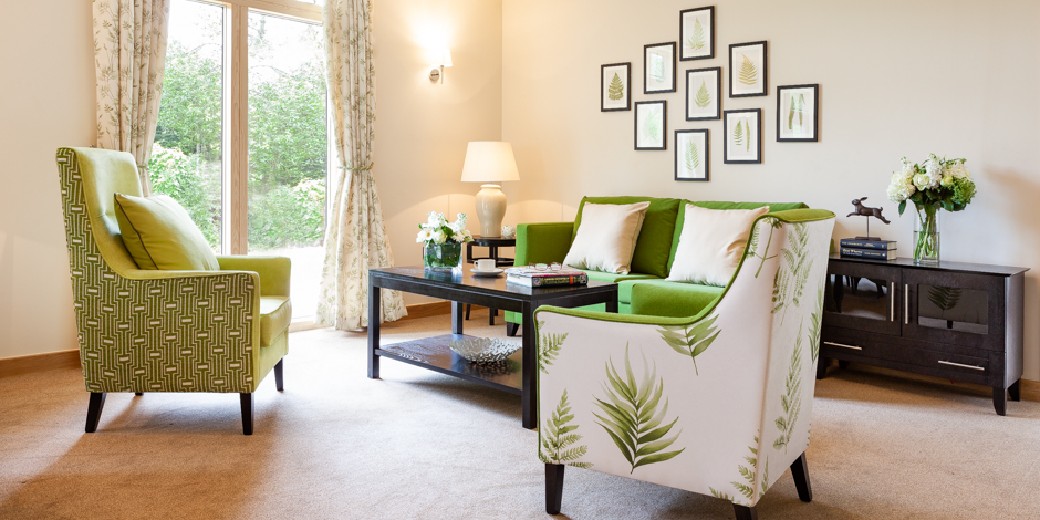
Elegant interiors can absolutely be achieved and still remain supportive. People with impaired vision need more light to see properly and colour contrast will provide real definition to their environment, enabling them to move around safely without fear of falls or walking into anything. I do feel that colour contrast can, for some people conjure up images of bright primary colours and fly in the face of their vision for a tasteful care home interior. I get this and fully understand the concern. Yet colour contrast is about the difference in light reflectance of a surface so can still be achieved through a tasteful palette. Interior schemes can be sophisticated and supportive of people living with poor sight.
 As well as having written for regional magazines including