The Role of Interior Design in the Care Environment
The built environment plays a key role in the health and well-being of residents, affecting both their physical and mental health. Good design can make the world of difference to how a resident, carer or relative will feel, whether it’s a care home or a retirement living development. Interior design should not be an afterthought, but integral to a new build or a refurbishment. Take a simple redecoration of a room and an investment in ten new high back chairs. Magnolia walls and the same fabric on all the chairs is such a missed opportunity to add so much more to the space. Choosing the right paint colour, mixing up the fabric combinations with some of the wonderful, well-priced performance fabrics on the market these days and adding a couple of table lamps and ensuring finishes have been selected with colour contrast in mind, will make a huge different to the impact of the redecoration.
So what would my top tips be? Well, like all design, function is the most important consideration. A room might look beautiful but unless it serves the needs of the people spending time in it and the furnishings and finishes have been chosen with practicality in mind, it will not “work”. As we age, our senses deteriorate and some people will experience cognitive impairment so the design must support these needs and enable residents to live as independently for as long as possible.
I am a firm believer that care homes should be warm and homely, environments which residents can relate to and settle in quickly. Whilst yes, the designs should have impact and an element of aspiration, I do not subscribe to the idea that care homes should emulate the 5 star hotel aesthetic. Obviously demographic plays a role here but that takes me back to my point about the environment being relatable.
Light. My starting point would be to maximise natural light wherever possible. Window treatments should be dressed back from the window and at the same time allow strong daylight to be filtered when necessary to avoid glare. Well thought through artificial lighting is a worthwhile investment. The wrong type of light can have an enormous impact on a scheme and greatly affect the colour rendering of furnishings and wall colours and also how people feel in a space. I see many care homes fitted with LED lights on the correct assumption that after the initial outlay, maintenance would be minimal yet the fitting is a cool blue light LED which renders any furniture or finishes with warm red tones, a far from uplifting muddy brown. Light fittings themselves should be diffused to avoid glare and flexible task lighting is a worthwhile addition to a scheme enabling residents to adjust light levels to suit their individual needs.
Lighting can also affect our body clock. Different colours of light have varied wavelengths which the human body responds to in different ways. The cool blue light of the morning kick starts our body clock; the presence of sunlight stimulates the brain to secrete cortisol which promotes a state of alertness, preparing us for the day. As the light changes through the day and then fades to the warm yellow of dusk, we receive the cue to start thinking about winding down and ultimately falling asleep. The science behind this cue is the hormone melatonin which the brain releases towards the end of the day, which causes us to feel drowsy. White and blue based lights will inhibit the secretion of melatonin which will consequently interrupt our body clock, upsetting our usual sleep pattern. So a cool blue light in a care home dining room at the end of the day is not conducive to a relaxed and restful evening for residents. Difficulties regulating the body clock are common in old age and particularly significant for people with dementia so getting the lighting right is essential.
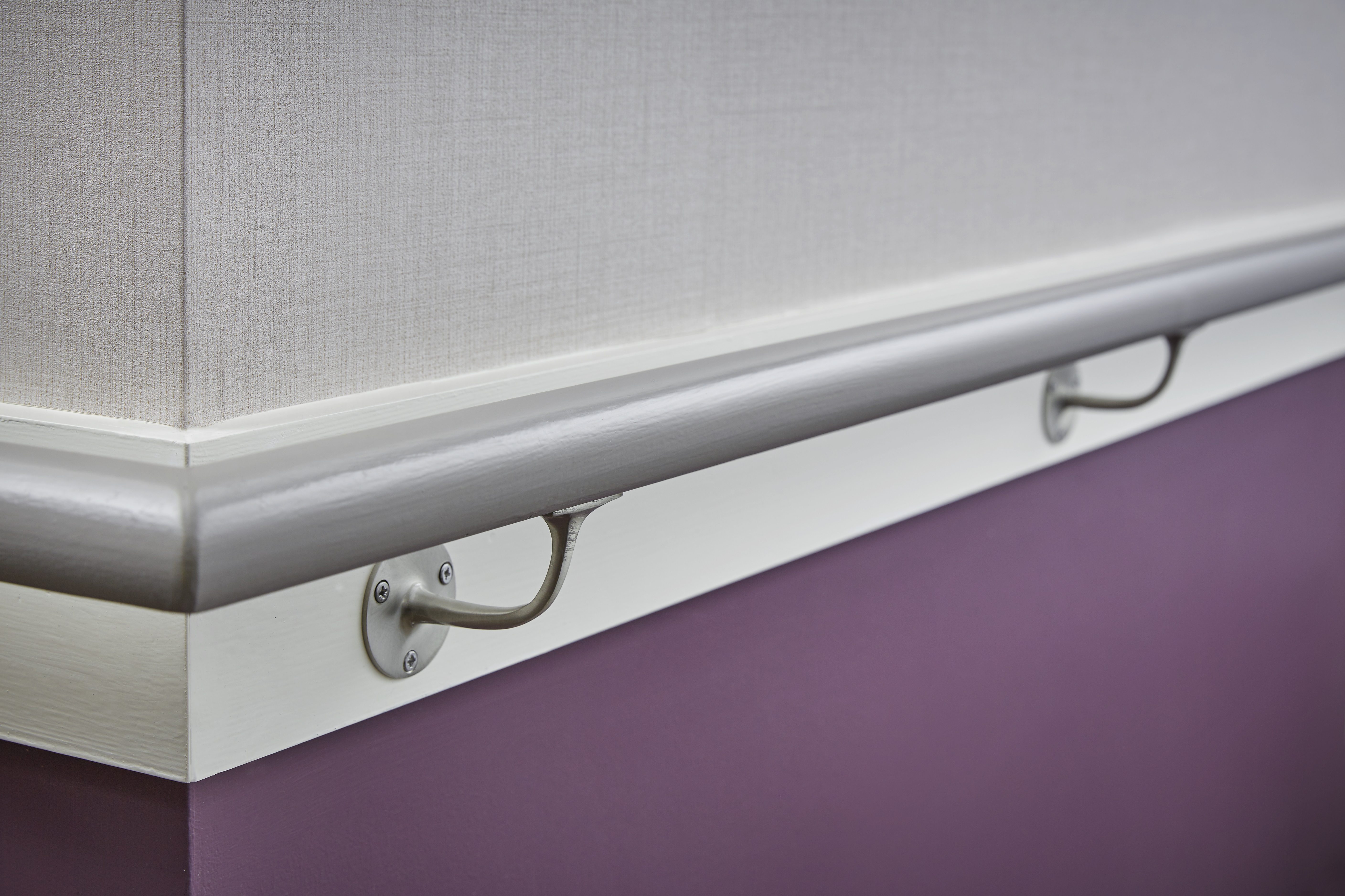
If I had to pick one thing which can make a huge difference in supporting independence in living environments for older people it would be colour contrast. Contrast between objects helps residents make sense of their environment and whilst it’s vital to apply this principle for people living with dementia, it also plays an important role in supporting those with age related sight issues. Ensuring that there is visual contrast between critical surfaces will help a person with poor sight, be it through dementia or old age, navigate their environment as easily as possible. Skirting painted to contrast with the floor will outline very clearly where the floor ends and the wall begins. Architrave painted to contrast with the wall will define where the door is. For two surfaces to offer enough contrast they must have a 30 point difference in their LRV, Light Reflectance Value which is a measure of the amount of light which a surface reflects back into a room where the lighter the colour, the higher the index. The same logic applies to light switches and fixings like grab rails in bathrooms.
Whilst colour contrast can help define a room, contrast in adjacent flooring surfaces should be minimal. A dark threshold strip or a dark floor mat against a paler toned floor can appear like a step to a person with dementia and might present a trip hazard. Similarly dark door mats can, to some, look like a hole. Ideally the flooring throughout the home should be the same colour regardless of the surface.
So colour contrast comes into consideration in choice of surfaces but the finish of those surfaces is also important. Hard flooring must be non-slip especially so in wet areas. It’s also important to select finishes that do not cause glare so avoid polished surfaces, choosing matt and brushed finishes instead.
Poor hearing is something that affects many older people and can in some cases lead to isolation and increase the chances of cognitive decline. Interiors should be designed with acoustics in mind, maximising sound but minimising noise. Think about position of kitchens and lifts in relation to resident areas and consider finishes choices such as acoustic flooring, noise absorbing window treatments and furniture such as room dividers which can help.
Furniture and décor should be relatable and the layout of the room should encourage social interaction with clusters of seating, ideally with varying seat heights so that residents can select a chair which most meets their comfort needs. Corridor seating is important, providing residents with resting places as they move from one part of the home to the other, encouraging them to be independent and sociable.
Colour itself plays an important role in designing for health and well-being. The correct choice of colour can make an enormous difference to how a person experiences being in a certain room, affecting how they feel, behave and interact with others.
Art and accessories are often seen as a nice to have but I do think they are an important part of a home; not only do they make it domestic in feel, they can also be used to help residents remember where they are. Which brings me on to wayfinding which should be enough to aid navigation but not overkill. Signs should be clear, light text on a lighter background is easier for the ageing eye to see, than dark on light.
 As well as having written for regional magazines including