Designing with sight loss in mind – colour and contrast guidelines
Colour plays a key role in interior design, although colour itself is tricky to define as what we see as colour is determined by factors such as the quality of light, the texture of a surface, contrast and psychological influences.
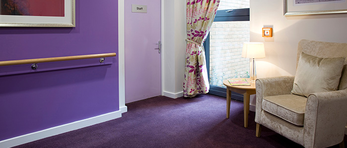
Colour and contrast help people distinguish between an object and its surroundings, so it is important to get this right when designing spaces for people with a visual impairment. Poor use of colour contrast can adversely affect navigation and safety, and consequently reduce a person’s sense of independence. Most of us take good sight for granted. I did until I lost the sight in my left eye two years ago, which affected my depth perception. We walk into a room and almost instantly understand where doors are or where a step might be. A person with a visual impairment will take longer to comprehend the space, looking for features and changes of surface. Only last week I was visiting a new client and walking into their utility room, I completely missed the change in floor level. The hall floor was stone and the utility room was a similarly toned vinyl but there was a step and I just did not see it. This is why colour and contrast are so important when designing for people with a visual impairment. Government regulations state that the minimum recommended contrast between two objects is 30 LRV (light reflectance value) points. The LRV scale runs from 0 to 100 where 0 is a perfectly absorbing surface such as black and 100 is completely reflective, for example white. Most companies publish the LRV for their products or will make it available on request.
For a scheme to work for a person with a visual impairment, here are the main areas to consider in the context of colour contrast:
- Floor and skirting board
- Skirting board and wall
- Wall and door frame
- Door frame and door
- Handle and door
- Signage and door
- Furniture and floor and furniture and wall
- Switches and sockets and wall
- Handrails and wall
- Stair nosings and treads
- Bathroom fittings and their surroundings
- Kitchen worktop, wall and cabinets
The type of lighting used needs to be taken into consideration, since the way the space is lit will have an effect on the colours, even if the correct LRV is used. For example, fluorescent lighting can make colours take on a bluish bias, changing the LRV rating. Lighting should provide an even distribution of light and minimise shadows and dark corners.
When considering which finish to use, matt and semi-matt surfaces are preferable to shiny. Shiny surfaces produce glare and can be extremely disorientating to a person with a visual impairment. This recommendation applies to all critical finishes, controls, appliances and fittings. From personal experience I know that even a door handle catching too much sunlight can cause discomfort and have me rapidly shifting my position in a room.
This is the fourth in a series of blogs focusing on design for people with sight loss. The blogs are written by Jacqui Smith in conjunction with the publication of a new design guide for interior designers. Jacqui lost the sight in her left eye in 2012. ‘Homes and living spaces for people with sight loss – a guide for interior designers’, written by Jacqui Smith and Thomas Pocklington Trust was published in October 2014. The guide will be available in hard copy and online at www.pocklington-trust.org.uk
 As well as having written for regional magazines including